You can ship a beautiful feed and still watch shoppers bounce, hesitate, and come back with more questions than answers. If you’re responsible for ecommerce UX, you’ve probably felt that tension between “more products” and “better decisions.” The uncomfortable part is that the data often points to the same root cause, which is why infinite scroll is bad for the kind of shopping that ends in confident purchases. More content can look like progress while customers quietly lose the plot.
This matters because infinite scroll isn’t just a layout choice, it’s a behavioral system. It changes how people orient, how they judge quality, how they compare value, and when they decide they’re done. The seven retro shopping rituals in this piece act like a set of design heuristics, each one highlighting a missing cue that endless feeds tend to erase. We’ll connect those cues to practical UX levers, like structure, pacing, narrative context, and commitment mechanics, so you can design browsing that supports intent instead of dependency.
1) Curated category hunts: Restoring orientation and intent

As an ecommerce UX lead, you’re accountable for how shoppers find what they’re actually looking for. That responsibility makes the current orthodoxy around infinite scroll worth questioning at the root.
Infinite scroll encourages passive browsing. Shoppers stop hunting and start drifting, which sounds harmless until you realize that a drifting customer rarely converts with intent. The feed replaces the hunt, and with it, the sense of arrival a completed search delivers.
The structure of discovery matters more than the volume of products displayed.
Retailers who’ve rethought this, replacing endless feeds with deliberate category architecture and load-more controls, report better interaction signals and stronger ad performance. That’s not a coincidence. It’s a structural outcome. When items appear linearly without natural stopping points, shoppers lose their orientation inside the catalog entirely.
Understanding why infinite scroll is bad requires examining what it replaced: the curated category hunt, a guided path through product space that gave shoppers both momentum and context.
If shoppers can’t ever feel the moment of arrival, how can they feel the difference in quality before they commit?
2) Tactile fabric fondling: The trust anchor infinite scroll kills

The answer lives in the fingers, not the feed. Shoppers who once roamed a fabric store didn’t just look at cloth; they pinched it, stretched it, held it to the light. That physical ritual wasn’t inefficiency. It was the decision engine itself.
Doomscrolling has replaced it with something categorically different. Infinite scroll platforms aren’t designed to help a shopper confirm quality; they’re engineered around variable reward psychology, the same mechanism that keeps a gambler pulling a lever. Users scroll compulsively because satisfying finds surface just often enough to sustain the behavior. Sensory validation never arrives, because the interface was never built to deliver it.
This is where understanding why infinite scroll is bad becomes structural rather than philosophical. AI-driven platforms optimize for engagement, not for the moment a shopper holds fabric to the light and decides it’s worth buying. No algorithm surfaces weight, texture, or stitching density. You can’t automate the hand.
When shoppers lose that tactile checkpoint, they lose the confidence anchor that converts browsing into buying. Uncertainty multiplies, and trust erodes, not in the product, but in the process of finding it.
Without contact, price isn’t a confirmation. It’s a negotiation waiting to happen.
3) Booth-by-booth haggling: How friction builds conviction

Negotiation is agency made audible. At the booth, you don’t just buy an object; you help decide what it’s worth. That back-and-forth isn’t inefficiency. It’s how a shopper builds conviction.
Participatory price discovery is what modern scroll-based browsing systematically destroys. When products load in an undifferentiated linear stream, without hierarchy, without deliberate pause points, shoppers lose the friction that builds judgment. They pass items without engaging them. They scroll past what they might’ve stopped to negotiate, compare, or reconsider.
The cost is measurable in attention. Users engage less with individual products when content loads without structure. Infinite scroll removes the decision points that force a shopper to ask: is this worth it?
That’s why infinite scroll is bad for conversion, not just for experience. It trades depth for volume, and volume without depth is just noise wearing a product catalog.
Shoppers who can’t revisit, filter, or anchor a specific item to a specific moment in their search don’t develop confidence. They develop fatigue.
So what replaces that lost rhythm, and can timing itself do the work that friction used to?
4) Sunset preview pacing: Restoring rhythm before fatigue hits

Timing can do that work, but only if you build pacing deliberately. Infinite scroll destroys temporal rhythm by stripping out the natural stopping cues that once organized a shopper’s experience into digestible arcs. Without those cues, browsing doesn’t feel open-ended; it feels unfinished.
Anticipation loops work differently. Think of the classic department-store model: new arrivals on Tuesdays, sale racks rotated on Fridays, the shopper’s week organized around those anchors. Timing wasn’t incidental; it was the architecture.
Endless scrolling collapses that architecture. Cognitive fatigue sets in not because there’s too much product, but because there’s no signal telling the brain when enough is a reasonable answer.
Attention fragments across hundreds of thumbnails, each carrying the same visual weight as the last. This is precisely why infinite scroll is bad for conversion: it removes the very pacing that lets shoppers build confidence instead of exhaustion.
You can reverse it. Temporal paging, scheduled drops, or “returning soon” states give the browse session a natural cadence. A shopper who knows a collection refreshes Thursday evening comes back Thursday evening, carrying curiosity instead of inertia.
That kind of trust doesn’t live in the product alone. It lives in the relationship a shopper builds with your store’s rhythm, and in the stories they start to attach to the people behind it.
5) Vendor chit-chat lore: Provenance beating price in infinite scroll
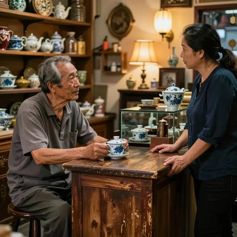
Provenance travels farther than price ever does.
When a shopper knows why a buyer took a chance on an unfamiliar label, skepticism dissolves into confidence. That origin story doesn’t emerge from a product tile on an endless feed. It requires context, and context requires structure.
Product provenance is the credibility layer that infinite scroll systematically strips away. Dynamic loading gives each item no fixed address and no surrounding narrative, leaving shoppers with sensation but no story. Search engines face the identical problem; without stable, crawlable URLs anchoring each product, a site’s structural logic disappears. Client-side rendering accelerates this, contributing to organic traffic decline that’s already sharpening heading into 2026.
Retro retail solved this intuitively. The vendor who named the village her olive oil came from made the sale with words your cart total confirmed. Recreating that dynamic online means giving each product a permanent, discoverable home with its narrative intact. The core reason why infinite scroll is bad isn’t technical at all. A scroll position simply has no story to tell.
Shoppers who understand where something comes from are also primed to compete for it.
6) Raffle-ticket earning: Progress that makes abandonment hurt
Competition doesn’t arrive on its own; you have to architect it.
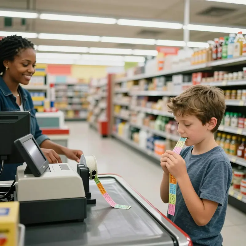
Retro shopping understood this instinctively. The raffle ticket earned through repeated visits, the loyalty stamp booklet, the in-store event registration, these were commitment devices that turned a passive browser into an invested participant. When a shopper spent three Saturdays checking a vendor’s new arrivals, they weren’t just browsing. They were accumulating skin in the game.
Gamified progression rewires the cost-benefit math of leaving. A shopper who’s earned three of five raffle entries doesn’t walk away casually. Abandonment now carries a price: forfeited progress. That’s exactly what infinite scroll dissolves. When the feed never ends and every swipe surfaces more ad-contaminated content, there’s nothing to protect by staying.
This is a core reason why infinite scroll is bad for conversion: it strips out the architecture of commitment entirely. Scarcity and stages create stakes. Endless content creates none.
Visual search tools can partially restore that structure. When a shopper uses an image-based search to find a specific item, they’ve already invested intent. The act of searching is itself a micro-commitment. Pair that with a progress mechanic, entries earned and thresholds approached, and you’re translating the raffle-ticket ritual into a format that actually holds.
That commitment logic scales only so far before it hits a harder ceiling.
7) Bag-filling thresholds: How completion cues check mindless spend

The ceiling is a budget. Shoppers walking into a physical store carry one, consciously or not, and the physical act of filling a bag makes it visible. Each item added is a micro-reckoning: do I still have room, do I still have money, is this worth it? That three-part check is a completion cue built into the ritual itself.
Infinite scroll dismantles all three questions at once. The research is unambiguous: these platforms are engineered to produce sporadic rewards, the same mechanism that makes slot machines sticky. Users recognize the trap. They feel it. They keep scrolling anyway, because the algorithm is optimized to sustain dissatisfaction, not satisfaction. A shopper who feels nearly done stops spending. A shopper who feels like the right product is just one more scroll away keeps going, keeps seeing ads, keeps generating revenue.
This is precisely why infinite scroll is bad for the people you’re trying to serve. Volume isn’t discovery. High volumes of low-quality content actively suppress meaningful finds, which means your best products get buried under the very mechanism meant to surface them.
Completion cues aren’t nostalgia. They’re architecture.
Final thoughts
When you line up these older shopping behaviors, a pattern shows up fast. Good shopping experiences don’t just “show more,” they help people build belief step by step. Structure gives orientation, sensory and social cues build trust, and well-placed friction creates judgment instead of fatigue. Add rhythm and completion signals, and shoppers stop drifting long enough to make real choices.
For UX leads, the point isn’t to romanticize the past, it’s to reuse what worked about it: clear paths, stable context, and moments that let the brain say, “I’ve seen enough to decide.” Infinite scroll optimizes for continuation, not conclusion. If you want higher confidence and cleaner conversion signals, design for endings, not endlessness. That’s the strategic core of why infinite scroll is bad, and it raises a practical question: what would your catalog feel like if every browse session had a satisfying finish?
Ready to elevate your business with data-driven strategies and expert insights? Contact CesarFeed.com ([email protected]) today and let our team help you grow smarter, faster, and more efficiently!
About us
CesarFeed is part of OnInitiative.com, an innovative marketplace that helps e-commerce businesses boost productivity and community growth through advanced automation tools.